Contact Form is one of the most essential parts of a website. It keeps your prospect customers connected with you forever and gives them access to communicate with you at anytime of the day. However, the contact form must have validated input fields which should also be marked properly to tell users about important fields. Additionally, the overall aesthetic appearance of a contact form also plays a big role in its success, and it should only have a few numbers of input fields so that users can fill it easily and in a short span of time. Therefore, your website’s contact form should never look dull and ugly, and must validate properly to keep the spammers away or else your email or database will be flooded with the spammy contact emails.

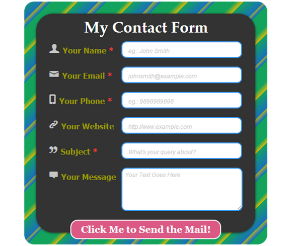
And if you don’t have an elegant and sleeky contact form on your website yet, that validates with jQuery, you need not to anymore, as with this blog post, we are going to tell you how you can make your own, HTML5 based contact form that validates with jQuery, in a shortest span of time. In the form that we will start building soon, we will be having 6 different input fields, namely; Your Name, Your Email, Your Phone, Your Website, Subject, and Your Message.
Here’s what we will be making today;

Before we begin to code this elegant contact form, we would like you to know you about the new HTML5 form elements, with which you can easily make a validated form without using jQuery. However, we would advise against it, as many old browsers don’t support HTML5 completely. Therefore, your form may not work properly on all browsers. Additionally, the client side validation can by bypassed easily therefore it is imperative to have a server side validation.
HTML5 New Form Input Types and Attributes

With HTML5, many new form attributes have been introduced for the first time. These elements can easily enhance the form functionalities, and also helps to keep the HTML code to minimal extent. In addition to this, as there are plenty of new HTML5 form attributes, it won’t be possible to include all of them in this tutorial, so we have listed below the ones that are being widely used.
Input Types
Input type=”email”: You can use this while setting a form field for an email address. The benefit of using this input type is that the supporting browsers will be able to recognize if a user has entered a valid email address or not.
Input type=”url”: If your contact form has an input field asking users to fill their website address/url, then using this input type would be beneficial for you, as it will detect whether a user has entered a valid URL or not.
Input Attributes
-
Required: To ensure that your users submits all the necessary information that is required at your end, you can use this new input attribute as it restricts the users to submit a form until all necessary form fields are filled properly. However, this will not inform the users about the important form fields by default; therefore, you mustn’t forget to place a visual indication.
-
Placeholder: With this attribute, you can provide your users with the form fields hint so that the users will be able to fill the information accordingly. For example the format for phone number. Once the user clicks on any of the form field that holds a placeholder attribute, the placeholder disappears instantly, and it reappears when the cursor is moved out of it.
-
List: If you have to make a form field that should comprise of a data-list containing all possible options that your users may enter then using a list attribute would be a better choice. With this attribute, you can easily set the pre-defined values for a datalist tag.
Form Attributes
-
Autocomplete: This attribute can be placed with anyone of its values i.e., ‘on’ or ‘off’, either for the entire form or for a specific form field. When it is placed with the value ‘on’, the modern browsers can automatically complete the field values with the ones that the user has entered before.
-
Novalidate: If you don’t want your entire form or any of your form fields to check for validation, you can simply put this attribute.
Note: The New HTML5 attributes and input types do not work on Internet Explorer 9 and its older versions.
As we have explained the new HTML5 form input types and attributes, we can now move ahead to the form development part.
Here’s the HTML code for our contact form. We have displayed the code that comes under the body tag, and above that is pretty common, and only includes the doctype, Meta tags in the header, and linked CSS and JS files.
The HTML
1 2 3 4 5 6 7 8 9 10 11 12 13 14 15 16 17 18 19 20 21 22 23 24 25 26 27 28 29 30 31 32 33 34 35 36 37 38 39 40 41 42 43 44 45 46 47 48 49 50 51 52 53 54 55 56 57 58 59 60 61 62 63 |
<body> <div class="wrapper mainForm"> <div id="main"> <h1>My Contact Form</h1> <form action="#" id="contactform" method="post" autocomplete="on"> <fieldset> <div class="main_row"> <label for="Name"> <span class="icon-user" aria-hidden="true" data-icon="👤"></span> Your Name <span class="required">*</span> </label> <span class="row"> <input name="Name" type="text" placeholder="eg.: John Smith" onfocus=" if(this.value != '') {this.value = '';}" onblur="if (this.value == 'eg.: John Smith') {this.value = 'eg.: John Smith';}" /> </span> </div> <div class="main_row"> <label for="Email"><span class="icon-user" aria-hidden="true" data-icon="✉"></span> Your Email <span class="required">*</span></label> <span class="row"> <input name="Email" type="email" placeholder="johnsmith@example.com" onfocus=" if(this.value != '') {this.value = '';}" onblur="if (this.value == 'johnsmith@example.com') {this.value = 'johnsmith@example.com';}"/> </span> </div> <div class="main_row"> <label for="Phone"><span class="icon-user" aria-hidden="true" data-icon="📱"></span> Your Phone <span class="required">*</span></label> <span class="row"> <input name="Phone" type="text" maxlength="10" placeholder="eg.: 9898989898"/ onfocus=" if(this.value != '') {this.value = '';}" onblur="if (this.value == 'eg.: 9898989898') {this.value = 'eg.: 9898989898';}"/> </span> </div> <div class="main_row"> <label for="Website"><span class="icon-user" aria-hidden="true" data-icon="🔗"></span> Your Website </label> <span class="row"> <input name="Website" type="url" placeholder="http://www.example.com"/> </span> </div> <div class="main_row"> <label for="Subject"><span class="icon-user" aria-hidden="true" data-icon="❞"></span> Subject </label> <span class="row"> <input name="Subject" type="text" placeholder="What's your query about?"/> </span> </div> <div class="main_row"> <label for="Message"><span class="icon-user" aria-hidden="true" data-icon=""></span> Your Message </label> <span class="row"> <textarea name="Message" id="message" placeholder="Your Text Goes Here!" onfocus="if(this.value != '') {this.value = '';}" onblur="if (this.value == 'Your Text Goes Here!') {this.value = 'Your Text Goes Here!';}"></textarea> </div> <div class="main_row"> <input value="Click Me to Send the Mail!" type="submit" class="Send" onclick="return validate();"/> </div> </fieldset> </form> </div> </div> <div class="wrapper successMsg" style="display:none;"> <div id="main"> <h1>Thank You! We have received your message, soon one of our representatives will get in touch with you.</h1> </div> </div> </body> </html> |

In the HTML5 code given above, we have done nothing new other than adding this kind of code line to all our form fields, which we will explain ahead, <–span class=”icon-user” aria-hidden=”true” data-icon=”👤″></span> Your Name <–span class=”required”>*</span>, and specifying a Placeholder attribute for all of them. Additionally, we have integrated some JavaScript code into it to execute the jQuery validation successfully.
The CSS
1 2 3 4 5 6 7 8 9 10 11 12 13 14 15 16 17 18 19 20 21 22 23 24 25 26 27 28 29 30 31 32 33 34 35 36 37 38 39 40 41 42 43 44 45 46 47 48 49 50 51 52 53 54 55 56 57 58 59 60 61 62 63 64 65 66 67 68 69 70 71 72 73 74 75 76 77 78 79 80 81 82 83 84 85 86 87 |
*{margin:0; padding:0} img,fieldset{ border:none} :focus{ outline:none} body { font-family: "Trebuchet MS", Arial, Helvetica, sans-serif;} .wrapper{ float:left; width:450px; height:395px; margin: 60px 90px 90px 300px ; padding:25px 25px 80px 25px; border-radius: 20px; -moz-border-radius: 20px; -webkit-border-radius: 20px; -o-border-radius: 20px; -ms-border-radius: 20px; margin: 90px 400px; /*The Striped Gradient Background*/ background: repeating-linear-gradient(-45deg, #15A35C , #15A35C 30px, #1973B8 30px, #C2B614 40px, #1973B8 40px, #15A35C 70px,#C2B614 70px, #15A35C 80px); } #main{ float:left; width:400px; height:370px; padding:30px 25px 50px 25px; background:#333; border-radius: 35px; -moz-border-radius: 35px; -webkit-border-radius: 35px; -o-border-radius: 35px; -ms-border-radius: 35px; box-shadow: 0px 1px 6px #242121;} h1 {color:#fff; text-align: center; font-size:2em; font-family: "Palatino Linotype", "Book Antiqua", Palatino, serif; font-weight:bold; margin: -25px 0 8px 0;} .required {color:#e53b3b; } .main_row {width:424px; float:left; padding-bottom:13px;} [data-icon]:before { font-family: mywebfont; content: attr(data-icon); speak: none; font-size:40px; color:#c5c5c5; text-shadow:#000000; } label { width:150px; float:left; color: #990; font-family:Tahoma, Geneva, sans-serif; font-size:16px; font-weight:bold; margin-top: -15px;} .row{ display:inline-block; width:220px;height:10px; border-radius: 10px; -moz-border-radius: 10px; -webkit-border-radius: 10px; -o-border-radius: 10px; -ms-border-radius: 10px; border:solid #39F 2px; background:#FFF; padding:10px 12px} .row input{ float:left; width:100%; background:none; border:none} ::-webkit-input-placeholder { font-family:Arial, Helvetica, sans-serif; font-size:12px; font-style:italic; color:#CCC; } input:-moz-placeholder, textarea:-moz-placeholder { font-family:Arial, Helvetica, sans-serif; font-size:12px; font-style:italic; color:#CCC; } #message { width: 240px; height: 80px; border-radius: 10px; max-width: 240px; max-height: 80px; -moz-border-radius: 10px; -webkit-border-radius: 10px; -o-border-radius: 10px; -ms-border-radius: 10px; padding-top: 5px; padding-left: 5px; border:solid #39F 2px; } .Send { width: 310px; height: 40px; background: #db5984; border-radius: 15px; -moz-border-radius: 15px; -webkit-border-radius: 15px; -o-border-radius: 15px; border:solid #FFF 2px; cursor:pointer; margin-left: 45px; font-size: 20px; font-family:Georgia, "Times New Roman", Times, serif; color:#f9f9f9; font-weight:bolder; } .Send:hover { width: 310px; height: 40px; background: #C36; border-radius: 15px; -moz-border-radius: 15px; -webkit-border-radius: 15px; -o-border-radius: 15px; -ms-border-radius: 15px; border:solid #FFF 2px; cursor:pointer; margin-left: 45px; font-size: 20px; font-family:Georgia, "Times New Roman", Times, serif; color:#f9f9f9; font-weight:bolder; } /*font face*/ @font-face { font-family: 'mywebfont'; src: url url(../font/mywebfont/entypo.eot); src: url(../font/mywebfont/entypo.svg); src: url(../font/mywebfont/entypo.woff); src: url(../font/mywebfont/entypo.ttf); } |
jQuery
1 2 3 4 5 6 7 8 9 10 11 12 13 14 15 16 17 18 19 20 21 22 23 24 25 26 27 28 29 30 31 32 33 34 35 36 37 38 39 40 41 42 43 44 45 46 47 48 49 50 51 52 53 54 55 56 57 58 59 60 61 62 63 64 65 66 67 68 69 70 71 72 73 74 75 76 77 78 79 80 81 82 83 84 85 |
function validate() { var isError = false; var errStr = 'Please Enter Your Name First.\n\n'; if ($.trim($("input[name=Name]").val()) == '' || $.trim($("input[name=Name]").val()) == 'Name' ) { errStr += '* Please Enter Your Name.\n'; isError = true; } if ($.trim($("input[name=Email]").val()) == '' || $.trim($("input[name=Email]").val()) == 'Email') { errStr += '* Please Enter Your Email Address.\n'; isError = true; } else { if (!isValidEmail($.trim($("input[name=Email]").val()))) { errStr += '* Please Enter a Valid Email Address.\n'; isError = true; } } if ($.trim($("input[name=Phone]").val()) == '' || $.trim($("input[name=Phone]").val()) == 'Phone') { errStr += '* Please Enter Your 10 Digit Phone No.\n'; isError = true; } else { if (!isValidPhone($.trim($("input[name=Phone]").val()))) { errStr += '* Please Enter a Valid 10 Digit Phone No.\n'; isError = true; } } if (isError) { alert(errStr); return false; } else { formSubmit(); return false; } } function isValidName(name) { return /^\s*[a-zA-Z,\s]+\s*$/.test(name); } function isValidEmail(mail) { return /^([a-z0-9_\.\-])+\@(([a-z0-9\-])+\.)+([a-z0-9]{2,4})+$/.test(mail); } function isValidPhone(phone) { return /^([0-9]{10})+$/.test(phone); } function formSubmit() { var data = $('#contactform').serialize(); $.ajax({ type : "post", url : "mail_action.php", data :data, success : function(msg){ if(msg) { $('.mainForm').fadeOut(); $('.successMsg').fadeIn(); } } }); $("input[name=Name]").val(''); $("input[name=Email]").val(''); $("input[name=Phone]").val(''); $("textarea[name=Message]").val(''); } |
The PHP Code
1 2 3 4 5 6 7 8 9 10 11 12 13 14 15 16 17 18 19 20 21 22 23 24 25 26 27 28 29 30 31 32 33 34 35 36 37 38 39 40 41 42 43 44 45 46 |
<?php $to = 'your_email_address'; $from = $_POST['Email']; $subject = "Default Title"; $message = '<html> <head> <title></title> </head> <body> <p>Dear '.$to.',</p> <table> <tr> <td colspan="2">Below are the details:</td> </tr> <tr> <td>Your Name : </td><td>'.$_POST['Name'].'</td> </tr> <tr> <td>Your E-Mail : </td><td>'.$_POST['Email'].'</td> </tr> <tr> <td>Your Phone No. : </td><td>'.$_POST['Phone'].'</td> </tr> <tr> <td>YOur Website : </td><td>'.$_POST['Phone'].'</td> </tr> <tr> <td>Your Message : </td><td>'.$_POST['Message'].'</td> </tr> <tr> <td> </td> </tr> <tr> <td colspan="2">Regards,</td> </tr> </table> </body> </html>'; $headers = "MIME-Version: 1.0\r\n"; $headers .= "Content-type: text/html; charset=iso-8859-1\r\n"; $headers .= "From: " . $from . "\r\n"; @mail($to, $subject, $message, $headers); echo('Thank You! We have received your message, soon one of our representatives will get in touch with you.'); ?> |
The Basic CSS Code
|
|
*{margin:0; padding:0} img,fieldset{ border: none} :focus{ outline:none} body { font-family: "Trebuchet MS", Arial, Helvetica, sans-serif;} |
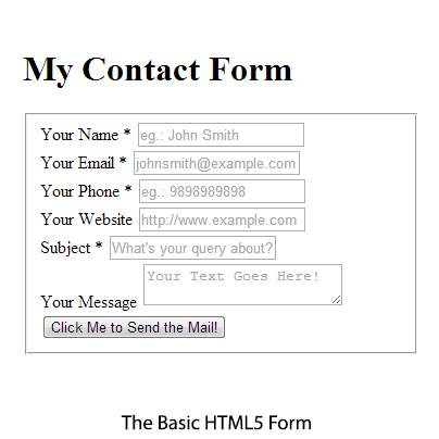
First of all let’s write the basic CSS code, like we have given above. With this code, our default margin is set to 0px, and the padding is also set to 0px. Then as you can see, we have set the border to none for the images and fieldset to get rid of the border that is coming in our basic HTML5 contact form (can be seen in the image given below). Though we haven’t used any images in developing this contact form, but we take it in our standard practice. After that, by using the :focus selector we have set the outline to none, this will help us get away with the border lines that may come while selecting any of the form fields. And to set the default font-family for all our text, we have used the body selector, and defined the fonts.
Now let’s create the striped background with the CSS and enhance the overall appearance of our contact form to make it look stylish and eye-catching. As you can see in our actual contact form image, we have a striped background, so let’s create that first. To create the striped background, we just need to specify the linear-gradient properties to the one element: .wrapper.
|
|
.wrapper { float:left; width:450px; height:395px; margin: 60px 90px 90px 300px ; padding:25px 25px 80px 25px; border-radius: 20px; -moz-border-radius: 20px; -webkit-border-radius: 20px; -o-border-radius: 20px; -ms-border-radius: 20px; /*The Striped Gradient Background*/ background: repeating-linear-gradient(-45deg, #15A35C , #15A35C 30px, #1973B8 30px, #C2B614 40px, #1973B8 40px, #15A35C 70px,#C2B614 70px, #15A35C 80px); } |
Let’s take a closer look at our background gradient code: “background: repeating-linear-gradient (-45deg, #15A35C, #15A35C 30px, #1973B8 30px, #C2B614 40px, #1973B8 40px, #15A35C 70px, #C2B614 70px, #15A35C 80px);”
Let’s define our gradient code in words to make it understandable, here’s what we are doing: creating a linear gradient with a -45° angle, the first strip is a green one, that goes from 0 to 30px, then add a blue strip from 30 to 40px, and the golden and blue one from 40 to 70px, then from 70px to 80px, the green one goes along with the golden one, and at last from 80px to 100px the green one goes again. And by stating a ‘repeating-linear-gradient’, we have repeated the whole gradient. Doing this, we have created a -45° striped “gradient” with a 30px green line, a 10px blue one, a 40px golden with blue one, and a 10px green with golden one, and again a 20px green that covers the rest 20% to make it 100%.
Styling H1 and Text Font
|
|
h1 {color:#fff; text-align: center; font-size:2em; font-family: "Palatino Linotype", "Book Antiqua", Palatino, serif; font-weight:bold; margin: -25px 0 8px 0;} |
For the h1 tag, we have selected a font-family comprising of the fonts namely; the Palatino Linotype, Book Antiqua, Palation, and the Serif font. These fonts are pretty common, and come per-installed in the computer itself. In addition to this, we have set the font-size to 2em, to make it look stand out, and also set its font-weight to bold. To bring it to the center of the form, we have set the margin to -25px from the top, 0px from the left, 8px from the bottom, and 0px from the left.
Adding the Little Icons, with No Images
If you are a beginner in web development, you might be wondering what’s all this about? And how can anyone add an icon to an html element without using an image? However, this is nothing more than adding a simple line of code by using the icon fonts. In the concept of icon fonts, each letter of the alphabet is mapped with an icon, and generating a font using them.

|
|
/*icon fonts for placing icons without using images*/ @font-face { font-family: 'mywebfont'; src: url url(../font/mywebfont/entypo.eot); src: url(../font/mywebfont/entypo.svg); src: url(../font/mywebfont/entypo.woff); src: url(../font/mywebfont/entypo.ttf); } |
For our contact form we have used the entypo icon fonts, which are available for free, and can be used on commercial projects as well under certain conditions. To use this font, we have put the font files inside the font folder just like we save the CSS file inside the ‘css’ folder and Images inside an ‘image’ folder. Once all the font files are saved, using the @font-face technique, we have linked them in our CSS file.
|
|
<!--- Add this small line of code to all your form labels inside the HTML5 file where you need a font icon ---> <span class="icon-user" aria-hidden="true" data-icon="👤"></span> /* Styling the Font Icon*/ [data-icon]:before { font-family: mywebfont; content: attr(data-icon); speak: none; font-size:40px; color:#c5c5c5; text-shadow:#000000; } |
Then by adding a small line of HTML code given above to every label in the HTML5 form file, and specifying the required icon’s no. as a value to the data-icon, we have successfully pointed the required icons. However, to give our font icons a unique style, such as setting their font size, and color, we have defined their properties inside the css. The noticeable thing in the CSS code for icon fonts, is the ‘:before’ selector, as we wanted all our icons to come before the HTML content. Similarly, you can also use the ‘:after’ selector to place the icons after your HTML content.
Isn’t that a simple yet effective technique to place icons without using images?
Styling the Send Button
As you can see in the HTML file, to make the send button we have used, the most common style that developers generally uses all around the world, input type=”submit”. A little bit of border-radius, adding the color, and setting the text margin and padding, all inside the CSS itself. Moreover, to differentiate the button on hover, we have only changed the color.
As you can see, our button has light pink color #db5984 in its background, along with a 2px white border, and a 15px of border-radius. And to make the border-radius work properly on all chrome, firefox, and opera, we have defined the vendor prefixes. However, the previous versions of Microsoft don’t support the vendor prefiex for border-radius, so the trick here is to use the pie.htc file, which can be found here.
The Thank You Message!
Presenting a successful form submission or confirmation message is a good practice that should always be followed. For our form too, we have used a customized Thank you message. For which we have used the h1 tag, which inherits the default h1 tag properties defined by us in the CSS. If you want you can change it in your css by denoting a new class or id to the tag inside the HTML.
jQuery Validation
|
|
var isError = false; var errStr = 'Please Enter Your Name First.\n\n'; |
First of all, we have created two variables namely; ‘isError’ and ‘errStr’. You can change these variable names to anything you want. As you can see, we have set the value for our first variable to False, and if the user tries to send the form after filling all the required details properly, it will validate the form, and doesn’t shoot up the error message just like we have defined with the second variable i.e., ‘errStr’.
|
|
if ($.trim($("input[name=Name]").val()) == '' || $.trim($("input[name=Name]").val()) == 'Name' ) { errStr += '* Please Enter Your Name.\n'; isError = true; } |
Then to get rid of the unwanted whitespace from the error dialogue box, we have used the ‘$.trim()’ function before every jQuery code specified separately for each form field. In the above code, you may have noticed a ‘+’, this is used for concatenating the strings. In this case the current string will get associated with our second variable that we created above, but only if there’s an error related to the ‘Name’ input field, and to ensure that this string is displayed only whenever there’s an error, we have set our first variable’s value to true.
For other form input fields we have repeated this code, and changed their errStr variable message with the appropriate one, along with the input name, and value.
Alert and Form Submission
|
|
if (isError) { alert(errStr); return false; } else { formSubmit(); return false; } } |
Here, we have set an alert for users to know that the form isn’t filled appropriately. And also set the form to submit if it finds no error.
|
|
function isValidName(name) { return /^\s*[a-zA-Z,\s]+\s*$/.test(name); } function isValidEmail(mail) { return /^([a-z0-9_\.\-])+\@(([a-z0-9\-])+\.)+([a-z0-9]{2,4})+$/.test(mail); } function isValidPhone(phone) { return /^([0-9]{10})+$/.test(phone); } |
As you may have already noticed in our form image, that we have only three input fields that are necessary for a user to fill, in order to submit the form. So we only needed to validate those three input fields. And here, with this code, we have defined what alphabets, special characters users can use for the respective fields.
|
|
function formSubmit() { var data = $('#contactform').serialize(); $.ajax({ type : "post", url : "mail_action.php", data :data, success : function(msg){ if(msg) { $('.mainForm').fadeOut(); $('.successMsg').fadeIn(); } } }); |
Here we have set the form to submit via ajax in a post format, by using the mail_action.php file. And if the form gets submitted successfully, it will present the users with a success message that we have talked about earlier. The noticeable thing here is the usage of ‘.serialize()’ function, which is used to create a text string in standard URL-encoded notation.
|
|
$("input[name=Name]").val(''); $("input[name=Email]").val(''); $("input[name=Phone]").val(''); $("textarea[name=Message]").val(''); } |
With these lines of code, we ensure that once the user submits the form, all form fields get back to normal for other users, otherwise their might be an instance when the other user may see a pre-filled form. It’s very basic, nothing hi-fi, here by defining the input names for all validated fields, we have kept their values to nil.
The PHP Code for Mail-to-Action
|
|
<?php $to = 'your_email_address'; $from = $_POST['Email']; $subject = "Default Title"; $message = '<html> |
To get the form data on email, we need to use the PHP, and for this form we have made a separate file named as mail_action.php. It’s again very basic, nothing unusual or extraordinary. In the second line, just define your email address, on which you want to receive the form data. Keep the third and fifth line as it is, as that’s with which you’ll be able to get the user’s email address, and his/her message.
However, you can edit the fourth line of code, and keep the subject whatever you want to.
The Email Format
1 2 3 4 5 6 7 8 9 10 11 12 13 14 15 16 17 18 19 20 21 22 23 24 25 26 27 28 29 30 31 32 |
<body> <p>Dear '.$to.',</p> <table> <tr> <td colspan="2">Below are the details:</td> </tr> <tr> <td>Your Name : </td><td>'.$_POST['Name'].'</td> </tr> <tr> <td>Your E-Mail : </td><td>'.$_POST['Email'].'</td> </tr> <tr> <td>Your Phone No. : </td><td>'.$_POST['Phone'].'</td> </tr> <tr> <td>Your Website : </td><td>'.$_POST['Phone'].'</td> </tr> <tr> <td> Subject : </td><td>'.$_POST['Subject'].'</td> </tr> <tr> <td>Your Message : </td><td>'.$_POST['Message'].'</td> </tr> <tr> <td> </td> </tr> <tr> <td colspan="2">Regards,</td> </tr> </table> </body> |
This is how the message will be displayed on your email id. In this sequence, you’ll get the name, email, contact no., website URL (if any), subject, and message.
|
|
$headers = "MIME-Version: 1.0\r\n"; $headers .= "Content-type: text/html; charset=iso-8859-1\r\n"; $headers .= "From: " . $from . "\r\n"; @mail($to, $subject, $message, $headers); echo('Thank You! We have received your message, soon one of our representatives will get in touch with you.'); ?> |
Here we have set the headers such as Multipurpose Internet Mail Extensions (MIME), the content type, and from. Then we have defined what we need to get or receive on email, like here we have set them to get us form subject, message, headers, and our email id that we can set inside the $to syntax. And to display the success message, we have set that to echo.
We hope this blog post may help you learn how to make elegant or classy HTML5 forms, and validate them using jQuery. If you like this blog post, please share your views with us via comment section provided below.


