All posts by XhtmlJunction

About XhtmlJunction

If you have a flair for writing and you have an interest in web development industry, then you have the best opportunity for connecting with web development giants. Write for XthmlJunction and instantly broadcast yourself to the web development industry.

WordPress 5.1

WordPress 5.1 is Available: Know Why You Should Try It

While the dust has not yet settled on the launch of version 5.0, the WordPress Core team has recently released the new version of WordPress, 5.1. Named “Betty” in honor of the jazz singer Betty Carter, WordPress 5.1 focuses mainly on enhancing the overall performance of the Gutenberg editor and paves the way for a more secure and faster WordPress.

No matter if you’re an ordinary end user or an experienced developer, the 5.1 revision of WordPress has brought something special for everyone. Let’s dive in and take a quick look at all the features and improvements made available with WordPress 5.1.

#Site Health

With security and speed in mind, the WordPress Core team has integrated Site Health features to the new version of WordPress. Starting version 5.1, WordPress will notify site administrators about a long-outdated version of PHP.

WordPress 5.1

Also, when you install a new plugin in WordPress, Site Health will check it against the PHP version of your WordPress site. If the plugin is not compatible with the current version of PHP, WordPress will prevent the installation of that plugin.

#Editor Performance

Introduced in version 5.0, the new Gutenberg editor has received solid performance improvements in version 5.1. Consequently, the editor now starts quicker and typing feels smoother than before. Given that the WordPress Core team is continuously working on improving the performance of the editor, expect more improvements to come in the next couple of releases.

#Multisite Metadata

With a new database table, named wp_blogmeta, introduced in WordPress 5.1, it has now become a breeze for developers to store metadata associated with sites. Additionally, WordPress 5.1 also allows developers to store arbitrary site data relevant in a multisite network.

#Cron API

In the previous version of WordPress, using a function to modify a task used to return vague values, making developers confused about the success of function call. To address this issue, the Cron API has been updated with several new functions to indicate developers about the success or failure of the function call. Moreover, to modify the Cron storage, new filters have also been added to the Cron API.

#New JS Build Processes

As a consequence of the large reorganization of code in version 5.0, WordPress 5.1 has been equipped with a new JavaScript build option that offers users a much smoother experience when they hover over menus or access the sidebar next to the content editor.

#Other Improvements & Fixes

Besides above-mentioned features and updates, WordPress 5.1 also attempts to make developers’ lives more convenient and easier with several minor fixes and improvements. These include:

  • Updates WP_DEBUG_LOG constant values
  • New plugin action hooks and new test config file constant
  • Short-circuit filters for count_users(), WP_User_Query, and wp_unique_post_slug()
  • A new human_readable_duration function
  • Improved taxonomy metabox sanitization
  • Limited LIKE support for meta keys when you use WP_Meta_Query
  • You get a new “doing it wrong” notice when you register REST API endpoints

and more!

That’s all about WordPress v5.1!

Interested in testing out WordPress 5.1? You can experience it in your Dashboard are by clicking “Please update now” link as shown below in the snapshot. Don’t forget to backup your site first.

WordPress 5.1

Alternatively, you can download the release candidate of WordPress 5.1 from here and test it out locally on your computer.

If you face any issue while upgrading your site to WordPress 5.1, feel free to get in touch with our WordPress experts.

WordPress X Theme

X Theme Review: The Most Popular Multi-purpose WordPress Theme

Have you ever thought of a WordPress theme that you could customize the way you like, and using which you could create any kind of site for any purpose? Thanks to X: a spectacular, dynamic and extremely customizable WordPress theme developed by highly talented folks at Themeco.

Publicized as “the last WordPress theme you’ll ever have to buy”, X is ThemeForest’s fastest and best selling item of all time. In this blog post, we’ll take a closer look at some of the outstanding features of the X theme, which played a vital role in making it extremely popular and successful.

Let’s start!

Key Features of the X Theme

WordPress X Theme Features

Stacks:

Unlike other themes that have only one design, the X theme comes with multiple unique designs, which are referred to as “Stacks”. Each stack has its own unique features and is crafted in such a way that anyone can instantly change the look and functionality of their site with just the click of a mouse. In a nutshell, stacks are “multiple themes within one powerful theme“.

At present, X offers four Stacks while more are under development. These are as follows:

  • Integrity: Multi-purpose design, suitable for business sites.
  • Renew: Flat design, perfect for creative blogging.
  • Icon: Sleek and minimal blog design.
  • Ethos: Great for magazine and newspaper sites, having featured post carousel.

Now you would have understood why no other WordPress theme is as versatile as X.

Responsive and Retina Ready:

Responsive X Theme

The X theme is designed with mobile in mind and fully optimized for high resolution displays. Whether you’re on 11” Netbook, 27” iMac, Android phone/tablet or Kindle Fire, every pixel of X will respond as it should. Instead of utilizing an adaptive layout (fixed break points), X developers have chosen to make use of a percentage-based (completely fluid) design that looks fabulous on all devices and screen sizes.

Customizer:

X Theme Customizer

The X theme features a live customizer that is built on the top of the native WordPress customizer. X developers have vastly upgraded the WordPress customizer to give you much control over the look and functionality of your site. Be it a font, a logo or even a layout, now you can see exactly how they look before getting published. There is no need to reload the browser and switch between windows over and over again; all of the changes you’ve made will be previewed live within the same browser window. Best of all, you can also import and export your settings for future use.

Excellent Shortcodes:

X Theme Shortcodes

Most of the premium WordPress themes use shortcodes as a part of the theme itself. This means when you make any change to the current theme or activate a new theme, the content of you site is broken. To solve this problem, the developers of X have made an easy to use plug-in that contains around 40 stellar shortcodes like pricing table, responsive slider and tabbed content etc. This means you can make changes to your theme as many times as you wish, no content will be broken until you deactivate/delete the plug-in.

eCommerce Integration:

X Theme - eCommerce Integration

The X theme fully integrates with popular WooCommerce plug-in, means you can effortlessly transform your normal WordPress site into a multi-billion dollar eCommerce storefront with a single click of mouse, without paying any extra cost. Every stack of X has one unique shop design that you can use as eCommerce solution for your site. Check them out below:

In addition, X also has full BuddyPress and bbPress integration.

One Page Homepages:

X Theme - One Page Homepages

Over the few years, one page sites have gained tremendous popularity in web design world. Do you also want to create a one-page scrollable website? The X theme will give you the power to do that. With its one page navigation feature, you’ll be able to create never-seen-before and interactive one page layouts for your visitors. Where you want to activate the one page navigation, on homepage or across multiple pages, the choice is completely yours.

Recommended by Elite Marketers:

X Theme - Elite Marketers Review

As the X theme is built in conjunction with renowned internet experts, so you don’t need to worry about things – like website speed, conversion, SEO, and copywriting etc – related to internet marketing. The developers of X theme have consulted smartest SEO, blogging and marketing experts before crafting it and the result is in front of you: the most feature rich WordPress theme on the entire planet.

Pricing:

You can buy the X theme from ThemeForest for just $63. May be the price of X seems too expensive to you, but don’t forget it offers absolutely everything you need to create a stunning website of any kind. Therefore, we think the price of X is fair and worth every penny. In short, buying X is like purchasing all themes for the price of one.

Conclusion:

With more than 29,000 downloads, the X theme really has become a great asset for WordPress lovers. However, developers of this spectacular theme have made numerous bold statements, like ‘the ultimate WordPress theme’, ‘one theme, endless possibilities’ and so forth, which may make you a little bit surprised. But one thing we’re sure of, the X theme would prove to be a huge boon for WordPress. Whatever kind of website you’re looking for; X would not disappoint you in any fronts.

The X theme is reviewed by XhtmlJunction Team. Contact Us for Custom WordPress Theme Development Service.

Responsive Web Design

8 Unique Benefits of Responsive Web Design [Infographic]

Responsive Design is a web development style where a website automatically detects the screen size or device on which it is being presented and adapts it accordingly. Having one code that works across all devices, it doesn’t only help developers avoid a lot of maintenance work but also provides users an optimal experience. So the demand of responsive websites is growing rapidly with the adoption of Smart phones and tablets.

Let’s take a look at following statistics:

  • Mobile internet usage is expected to overtake PCs by the end of 2014.
  • Currently, more than 50% of all local searches are performed on mobile devices.
  • According to a recent research study by Google, 98% of people use multiple devices during the same day to accomplish a task.
  • A recent ComScore’s report revealed that more than half of the world’s population uses mobile devices to log into social media sites.
  • eMarketer, a research analyst company, has made a prediction that over 75% of global users will be using Smartphone before the end of 2017.

All the above facts demonstrate that Responsive Web Design is the future of web design and online marketing. Considering rapid growth in popularity of responsive web design, we’ve designed an infographic that will make you exposed to the reasons why you should adopt this trend.

For more information, take a look at our infographic!

Responsive Web Design Benefits

Happy 4th of July - Xhtmljunction's Offer

Celebrate the Spirit of America. Happy Independence Day

In honor of Independence Day, you can get 10% discount on our all services! The offer is starting on July 4 and will last for one week. Just place your order and get your design converted into our high quality, W3C validate and 100% hand-coded markup at a flat 10% discount. To avail this offer, order online and use promo code 4july10.

Enjoy!

Email Marketing Guide

The Definitive Guide to Optimize Your Email Marketing Campaign

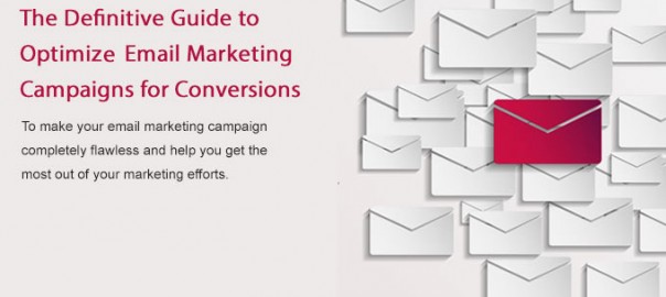
To make your email marketing campaign completely flawless and help you get the most out of your marketing efforts, we’ve made this handy guide that will help you learn how to:

  • Get More Email Opt-Ins
  • Write Impressive Email Messages
  • Design Effective Emails
  • Improve Email Deliverability
  • Get Email Open and Click-through Rates Increased
  • Boost Landing Pages Conversion Rate

Let’s start with “Get More Email Opt-ins”!

Get More Email Opt-Ins

#Add a Sign Up Form to Your Home Page:

Place a sign-up form on the homepage of your website to make your visitors leave their contact information instantly. Keep the form simple, short and impressive to actuate people to fill it.

#Make It Easy to Subscribe:

People usually hesitate, when they are asked to fill a lot of personal information online. Therefore, your sign-up form should make the subscription process easier for visitors. Don’t ask for too much information, it may annoy your visitors.

#Place a Link to Sign Up in Email Signature:

Don’t let your email signature go to waste. Add a link to your subscription form below the email signature in your emails, describing advantages of your newsletter, some special offers and promotions.

#Modify the Text of Submit Button:

Whether you’re offering subscription or a free Giveaway on a landing page, it’s recommended to use benefit-driven labels in your button, such as “Get a free e-Book right now” or “Subscribe to stay tuned with us”.

#Welcome Your Each New Subscriber:

Whenever a visitor confirms his subscription, you should send a welcome letter to him. It’ll not only help you create a relationship with your potential customer, but also confirm that you’ve got the required information from the subscription form.

Write Impressive Email Messages

#Make Your E-mail Messages Unique:

People get flooded their inbox with lots of emails daily, so you need to make your email messages exclusive to stand out from the crowd. Keep your messages clear and concise, including a clickable link to register and your call to actions.

#Persuade Readers With Your Words:

Write naturally, and explain the subject clearly. To persuade people to do what you want (to accept your offer or to click the link), you need to know what solution are your readers looking for, what are you offering, why should they use it, how will they be able to use it, and who exactly will get the most out of the offer?

#Keep Subject Headings Accurate and Descriptive:

People are interested to know who is communicating with them, so include the name of your company in the heading. Use short but informative subject headings to make your readers curious in the topic of your letter.

#Don’t Waste Your Readers’ Time:

To make your emails worth reading, add a table of contents in the beginning of email content to make it easy for readers to choose which point they want to read first. Also, try to show the main points in the in the E-mail Subject Line.

#Create a Plain Text Version of Your Email:

Remember that some mobile devices and email clients cannot display HTML text, so don’t forget to use a plain text version of your message.

Design Effective Emails

#Get Personal with Smart Segmentation:

Email List Segmentation is the secret of making your digital Marketing profitable and successful. Send special messages to “welcome new campaign visitors”, using an automated welcome program.

#Don’t Code Emails Too Narrow or Too Wide:

To make sure your email will fit in the preview pane of most email clients, keep email width not more than 600 pixels.

#Put the Copy Above the Fold:

Put the copy of your email on a single screen above the fold to provide your visitors a better reading experience, enabling them read your email until the end without scrolling.

#Some Really Cool Things Won’t Work in HTML Email:

ActiveX, JavaScript, Flash, and videos usually don’t work in HTML emails. Often you can send them, but your recipient most likely would not be able to see them. That’s because most email programs block this cool stuff for safety.

#Test Emails:

Before sending your emails to clients, test them in most popular email applications such as Apple Mail, Lotus, Outlook, Eudora etc. and in different webmail services such as Gmail, Hotmail, and Yahoo.

Improve Email Deliverability

#Run Your Message Through Spam Filters:

If you don’t use spam filters, your newsletters may be mistakenly deleted or moved to the junk folder. Therefore, use a spam checker to test your mails before you send them out to the world.

#Ask Subscribers To Whitelist You:

To get to your subscribers’ white list before you send them a welcome letter, add an “add-to-sender-list request” in your subscription form. If a person forgets to add you to his whitelist while subscribing to your newsletter, repeat the request in your welcome message to remind him.

#Use Double Opt-in Confirmation Process:

The double opt-in or confirmation method is the best solution to make your single opt-in subscribers, who don’t want to receive your newsletters, agree to be on your mailing list. So, implement double opt-in method to build your email list.

#Be Careful With Attachments:

Most of the email systems have an attachment size limit, for example: Gmail allows you to send messages up to 25MB in size. So avoid sending large attachments, as this may annoy people who use slower Internet connections.

#Send Authenticated Email:

Email providers make use of authentication protocols to verify whether the sender of an incoming message is legitimate or not. So properly authenticate the “From” address.

Get Email Open and Click-through Rates Increased

#Use a Strong and Engaging Subject Line:

Write the subject line that could persuade your clients to read the whole email. Avoid writing your subject lines like advertisements.

#Use a Personalized Email Address:

Personalized email address doesn’t only help you get a unique and memorable personal email account, but also makes you seem more legitimate. So, use personalized email with such information as a name or a user name.

#A Clear Call to Action:

Include a clear call to action in your every letter that lets your readers clearly know what you expect them to do, where should they click and what should they order.

#Pay Attention to Snippet Text:

Snippet text is the first line of your message that your clients view in the preview pane. Make sure it describes the letter’s content and has a link to the offer.

#Monitor Your List Statistics:

Watch your list statistics to determine unsubscribers, inactivity and bounces, especially when you’re going to add new lists or start a new email campaign.

Boost Landing Pages Conversion Rate

#Have a Separate Landing Page for Each Offer:

Never use one landing page for multiple offers. Also, remove links to other pages or resources on your site because they can pull your subscribers away from your offer.

#Keep the Headline of E-mail and Landing Page Similar:

For better conversion, repeat the headline from your e-mail message at the top of your landing page. This is the best way to give your visitors a feeling of familiarity and tell them that they have landed on the right page.

#Pre-populate the Form on Landing Pages:

This is the one of the easiest ways to increase conversion rate. If a visitor comes to landing page from your email campaign, don’t ask him to re-type the information. Keep the forms on landing page simple and pre-filled.

#Keep It Short and Sweet:

On the landing page, try to keep all the content above the fold. Don’t let your visitors scroll up/down to find the required information. If they face any problem in finding what they’re looking for, chances are they won’t convert.

#Track Results:

Track your results to know what worked and what didn’t work and accordingly make required improvements to enhance performance. As a general rule, your landing page and email message should work together closely to achieve best results.

Tips to Avoid 404 Errors

404 Errors – 6 Ways to Avoid Them

To provide your visitors a better experience, a better approach is to prevent the 404 page ever being shown to them. Following are the things you can do to avoid 404 errors:

  • Schedule your site crawls regularly to uncover broken links on your site. Here is the list of tools to check broken links.

  • Keep your permalinks well-structured from the start of project, so there will be no need to make any changes to them in future.
  • Monitor all incoming links to your site. If any incorrect link is found, contact owner of the website (from where the incorrect link is coming), with a request to correct it.
  • Remove the old content only when it’s absolutely necessary, and migrate pages with proper redirects.
  • If you’ve moved your site to a new domain, always update the details on search engines.
  • Set up alerts for 404 error pages in Google Analytics.
404 Error Page Practices

404 Error Page Best Practices and Examples

What is 404 page?

A 404 page is what user gets if they try to access any URL which don’t exist.

What causes a 404 error page to show?

Following are the most common reasons why a 404 error page is displayed to visitors:

  • The website is offline or unavailable: The website is temporarily down, so the requested web page is not available to users.
  • Misspelled links: The link might have been misspelled, then it’ll take you to a page that is not available.
  • The page has been moved or deleted: A 404 error page is often displayed when a web page has been moved or deleted.
  • Updated URL: Changing the name or URL of a web page may take visitors to a 404 error page.
  • The website has been deleted: The website doesn’t exist anymore.

Why is the default 404 error page bad?

If user encounters the default 404 error page on your site, it’s bad in following ways:

It has tech jargon:

The default 404 error page contains technical terms which really means nothing to an average internet user. Example:
“404 Error”
“404 Not Found”
“Error 404”
“The requested URL [URL] was not found on this server.”
“HTTP 404”
“Error 404 Not Found
“404 File or Directory Not Found”
“HTTP 404 Not Found”
“404 Page Not Found”

It’s not customized:

If a user is enjoying the beautiful design of your website, and then suddenly he faces an ugly plain white page with black text, he might get irritated and confused. This makes him feel uncomfortable, as he might think that he has been redirected to another site.

There are no links to follow:

When a visitor see a default 404 error page, he found himself on a page where he doesn’t have any other option than clicking the “back” button in the browser.

How to test your 404 page?

To test your 404 page, just enter “www.yourwebsitename.com/404” in your browser’s address bar.

In case a website doesn’t have a custom 404 error page, then a default error screen like this will be displayed to visitors.

How to create a killer 404 page?

There’re a number of things you can do to create marketing focused 404 page. Here is the list:

1. Include an apology for the error

Be nice, friendly, and courteous to your visitors. Write apologetic and helpful wording which can make them feel great.

2. Add a prominent search box

If a page on your site has been moved, allow your visitors to search for where it has been moved to. You can simply do this by adding a search box to the 404 page.

3. Include a link to your home page

Instead of leaving your visitors with nowhere else to go, add at least a link back to your home page. This way, visitors can easily know who you are and what so you do.

4. Add a link to your sitemap

You can also provide a link to your sitemap. This way a user will be able to browse every section of your website and hopefully find what they’re looking for.

5. Include your contact details

When everything fail, adding your contact information will give the visitor a chance to contact you if they can’t find what they’re looking for.

6. Allow visitors to report a broken link

When a visitor has found a broken link on your website, give them an easy way to report that broken link. For this purpose, you can either add a simple email form or a button that will send the broken link URL to you.

7. Include links to the other main areas of your site

It is also possible that a visitor might be searching around for one of the key areas of your site. Therefore, it would be useful to add links to all those main areas.

8. Keep the design similar to the rest of your site

Give your 404 page a look and feel exactly like other pages of your site. It should look exactly like your website, so that there’s definitely no confusion in visitors’ mind that they are taken to an external site.

Beautiful 404 Error Pages

A. FI Blog (blog.f-i.com/404)

blog.f-i.com - 404 Error Page

  • Clean page with great navigation.
  • It has an error message.
  • Link to home page.
  • Search box.
  • Latest posts with the images, so keep user on the site.

B. Beanstalk (beanstalkapp.com/404)

beanstalkapp.com - 404 Error Page

  • Provides link to the home page.
  • Describes possible reasons why the visitor has encountered this page.
  • Users can report a broken link, so admin can fixed it.

C. Onwired (onwired.com/404)

onwired.com - 404 Error Page

  • Reason for an error page.
  • Search box.
  • List of popular and recent posts.

D. Jamie Huskisson

jhuskisson.com - 404 Error Page

  • Graphical design.
  • Quick intro about the owner of the site with a link to contact him.
  • Search box.

E. User Interface Engineering

uie.com - 404 Error Page

  • Possible reasons for the 404 error.
  • Allows visitors to report a broken link.
  • Link to other most popular pages.
  • Subscription box.

F. Mailchimp (mailchimp.com/404/)

mailchimp.com - 404 Error Page

  • Customized error message, so you know what have you typed
  • Great design
  • Search box and menu links.

Essential tips to dramatically improve your “About Us” page

“About” page, as the name itself implies, is the page that introduces yourself to your visitors, letting them know the reason of existence of your business. This single page serves an important role in turning your first time visitors into potential customers, capturing new business opportunities, and gaining a deeper appreciation of your site from your regular users.

Believe it or not, building a healthy relationship with your visitors begins with telling them a few things they always want to know: who are you, what do you do, when did you start doing what you’re doing, where are you, and why (or how) are you the one to achieve what you claim to do? An about page works as the platform where your visitors can get answers of these five Ws (who, what, when, where, why) without any trouble.

Why it matters?

If you’ve ever checked your stats using service like Google Analytics, you’ve noticed that your “about” page is probably one of the most visited pages of your website. This shows, why having an about page on your site is so important and how people try to know more about you and your organization from the about page. About page plays an important role in branding your business, creating a positive public image for your company, and building relationship with potential customers and make your business stand out from the crowd.

Elements of a Brilliant About Us page:

All of the top-notch about page designs employ a combination of the following elements. We suggest you to put all these things on your about page to build trust and credibility with your visitors.

  • Try to make the copy on about page informative, authoritative, and fascinating.
  • Explain who you are and what you can do or offer.
  • Write appealing content in a conversational tone. Be original, warm and approachable.
  • You can also add a short and sweet video, demonstrating your expertise in your field. But don’t have it start playing automatically.
  • To assure your visitors that your company is legitimate, add logos of your past/existing clients, some testimonials, and other authenticity statements.
  • Badges indicating your strong points, awards, tie ups, publications, certifications, and so forth make nice additions to the page.
  • Include a brief introduction to founder of the company. Also add pictures and bios of team members and senior management.
  • Don’t forget to add important details like date of incorporation, office location(s), and team strength.
  • Add links to your professional social networking profile to begin building relationships and grow your online network.
  • Also, highlight your company’s facts and major achievements. Provide title to each section.
  • Make sure this page has correct and updated details regarding you and your company. So update the page whenever needed.
  • Provide a solid reason for your users to choose you. Tell your visitors what makes you different from others in your field and why they should put their faith in your services.

5 Great Examples of About Us Page:

Though everyone has their own perspective on creating an about page, but here we’ve analyzed five of the stunning and well designed “about” pages and explained why they are better than the rest. Learn about essentials of an excellent about page through these 5 real-life examples and also get an idea as to how you can emulate the best things of these pages on your own website.

# ZURB:

ZURB

Why it’s brilliant:

  • First they’ve explained their reason of existence in “why they’re in business”, and their achievements by providing stats like “generated over $1.6 billion in market capitalization”.
  • Then elaborated what they do very well by categorizing their services in 4 sections: Studios, Foundation, Design Apps, and University.
  • Created manifesto which validates their knowledge and experience, and also builds trust with users.
  • Team members’ pictures to provide personal touch.
  • Displayed live, latest tweet.
  • Providing links to their social networking profiles, they’re taking full advantage of social media to grow their online network.

# Mammoth Media:

Mammoth Media

Why it’s brilliant:

  • Nice and very interactive layout.
  • Instead of boring formal page, they provided details regarding their location, work ethics, and style in more friendly and personal way.
  • Provided information regarding their services and again explained it very well.
  • Providing logos of their clients and having name – like MacDonald’s, Beck’s, MetLife, Red Bull – builds immediate trust and credibility.
  • Added an industry-related quotation to impress visitors.
  • Best of all, the copy on this page is very intriguing and conversational.

# The Omni Group:

The Omni Group

Why it’s brilliant:

  • Very well explained who they are, services they provide, reason to choose them, and their location in one small paragraph.
  • Contact details provide a way to get in touch with Omni group.
  • Showcasing awards build credibility and trust.
  • Added Team members’ picture and bios, which explains their experience.
  • Page content is written in a storytelling style, so visitors can connect with it more.

# Shopify:

Shopify

Why it’s brilliant:

  • Nice graphical way to show major achievements.
  • Message from Daniel Weinand, company’s Co-founder makes it personal and shows the vision and enthusiasm of the senior management.
  • Important details –such as date of inception, no. of employees, and total funding – are displayed in numbers, which let visitors quickly know about their organization.
  • Real time update on product sold provides a sense of trust.
  • The beautiful slider, showing their workplace culture, gives talented people a reason to join their team.
  • Team members’ pictures with their twitter profiles encourage online networking.

# Nurun:

Nurun

Why it’s brilliant:

  • Spectacularly represented who they are in a single line.
  • Provide links to official social media profiles, Nurun invites and encourages visitors to make connection.
  • Displaying address with link to their location on map, the company has made an effort of giving an evidence of its legitimacy to their visitors.
  • Like Shopify, Nurun has also shown significant details – like how many offices it has worldwide, total no. of employees, and experience in industry – in numbers.
  • Mentioning their areas of expertise clearly lets visitors immediately understand what the company does.
  • Blocks, showing the location of company’s different offices with phone and email id, attracts more local clients.

Save

Social Media Managment Tools

10 Essential Tools to Manage Your Social Media Marketing Effectively [Infographic]

When you search “social media marketing tools” on Google, it returns about 15,40,00,000 results. Where to start? Nowadays, Social Media is such an arena where having a consistent presence on all the major platforms – like Google+, Facebook, Twitter, LinkedIn, and Pinterest – is a must for any business to get succeed. There is no doubt that social media is a great way to build a community around your brand, company, and product or service, but managing your social media marketing proves to be a challenge. Continue reading

YouTube Channel Optimization

10 Ways to Make Your YouTube Channel Stand Out from the Crowd [Infographic]

Do you know YouTube is the second most popular, widely used and largest search engine after Google? This world’s top online video service is generally considered as a great resource for sharing and viewing personal videos, but it can also be a valuable tool for your business to reach out and engage with your customers. Nowadays, more and more businesses and marketers are delving into this extremely powerful tool to increase their brand awareness and presence on the web. Continue reading