Mobile-First Indexing for WordPress: What It Is & Tips to Optimize
If you like to keep up with the latest Google’s algorithm changes, you might have noticed that the search engine giant has been placing a big emphasis on mobile over the past few years. Whether it is about making a website mobile-friendly or gradually shifting its search index to mobile-first, Google is indeed leaving no stone unturned in showing more relevant search results to mobile searchers and making the web universally accessible to everyone.
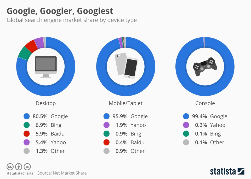
Given that mobile use is continuously on the rise and Google alone drives over 96% of mobile search traffic, optimizing your WordPress site for Google’s Mobile-first Indexing becomes imperative to rank higher in search engine result pages (SERPs) and get more organic traffic to your WordPress site. If you implement the tips given here, you’ll be able not only to leverage mobile-first index to its fullest but also to avoid any potential SEO disasters. But first, you need to understand what Mobile-first indexing actually is!
What is Mobile First Indexing?
Google, since its inception, has been ranking websites through a desktop-oriented method of indexing. Up until the day it made an official announcement about rolling out mobile-first indexing, Google used to look at the desktop version of a page’s content to evaluate how much relevant it is to user’s query.
And this approach was undoubtedly perfect because users were primarily using desktop computers to perform searches. However, realizing that the majority of users today search using a mobile device, the search engine leader decided to use the mobile version of a website’s content to:
- Index and rank pages from that site
- Understand structured data
- Show snippets from those pages in search results
- Deliver users a great search experience by helping them find exactly what they’re looking for, irrespective of whether they come from mobile or desktop devices.
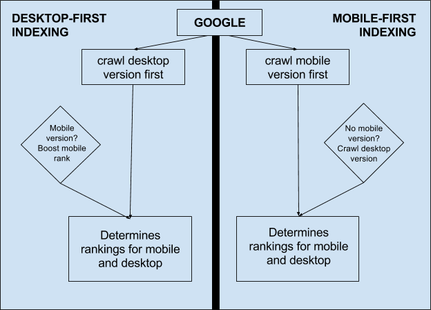
In simplest terms, mobile-first indexing means that instead of the desktop version, Google now uses the mobile version of a website as its primary search engine index to determine its ranking in search results – even if the search is initiated from a desktop device. An important thing to note here is that mobile-first index is not separate from Google’s main search index. It still uses one single index to serve users relevant search results from all websites and apps.
Since we’ve not yet seen a “mobile-only” shift, Google still includes the desktop version in the search index, if a website doesn’t have a mobile-friendly version and only has a desktop version. This means not having a mobile-friendly version doesn’t directly affect your website’s rankings but it definitely hurts user-experience on mobile devices, which eventually leads to drop in both organic traffic and website ranking.
Given the fact that 78% of people come to know about a business for the first time through a mobile device, it is always better to have a mobile-friendly version of your WordPress site to get the potential ranking boost. Let’s now understand what impact Google mobile-first index has, depending on the type of WordPress site you have:
- Desktop only: If your WordPress site doesn’t have a mobile-friendly version, there is no need to change anything. However, keep in mind that Google looks at it through the eyes of a mobile user.
- Responsive Web Design: If your WordPress site is fully responsive, you’re 100% safe as it already delivers users an excellent mobile experience.
- Canonical AMP: If all pages of your WordPress site are created in AMP HTML, no need to worry about ranking.
- Separate URLs: If your desktop site has a separate mobile version with an equivalent m-dot URL, Google prefers the mobile URL over desktop URL for indexing and ranking.
- strong>Dynamic Serving: If your WordPress site dynamically serves different content on different devices on the same URL, Google prefers the mobile-optimized content for indexing and ranking.
- AMP and non-AMP: If both AMP and non-AMP versions of a web page are available, Google prioritizes the non-AMP mobile version for indexing and ranking.
Optimizing Your WordPress Site for Mobile-first Index
Thus, if you’re already using a responsive WordPress theme that delivers users an equal mobile and desktop experience or if you have a desktop-only website in place, you really don’t need to change anything – just ensure that your WordPress site loads at the speed of light.
However, if you’re serving two (or more) versions of your WordPress website, make sure you follow the best practices below to optimize your site for mobile first indexing.
Review and Amend the Content:
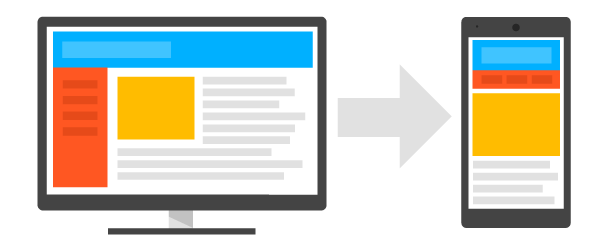
If you have more than one version of your WordPress site, make sure all versions contain the same content as your desktop site. To be more specific, the mobile version must feature the same content as the desktop version of your website. Generally, rather than creating a mobile-friendly version with the same content, people prefer to use a watered-down version of their desktop site for mobile users. This was okay in the past but today if you want to rank higher in search engine results, you’ll have to make your mobile website completely equivalent to its desktop counterpart.
To make your WordPress site compatible to Google mobile-first index, make sure the mobile version contains everything – whether it is text, images, videos or anything else – available on the desktop alternative in the usual crawlable and indexable format. This way, your users will be able to access all your key content even from mobile devices. The best way to do this is probably by first exporting the content from the desktop version and then importing it into the mobile installation.
Speed up Your WordPress Site:
Since Google recently started taking the speed of a web page into account while determining rankings in mobile search results, speed is one of the most important factors you must focus on while optimizing your WordPress site for the mobile-first index. No matter how fast your desktop website is, you could still experience a drop in your search engine rankings if your mobile site takes too long to load.

To check how fast your WordPress site renders on mobile devices, you can use both Test My Site and PageSpeed Insights tools provided by Google itself. As a general rule, your mobile site must load in 3 seconds or less. If it takes longer than that, consider making some changes to your site. Here are a few suggestions to help you get started:
- Implement Google AMP
- Turn your website into a Progressive Web App – an alternative to AMP
- Remove unnecessary images
- Compress images to reduce file size
- Activate browser caching
- Decrease HTTP requests
- Reduce Redirects
- Optimize your theme and plug-ins
- Move your WordPress site to a faster web host that is able to handle increased crawl rate.
That said, even if you have a fully responsive website, you must prioritize page speed to deliver users a smooth mobile experience.
Pay Attention to Technical SEO:
When optimizing for mobile-first indexing, another critical area you should focus on are the technical elements of your mobile site. In addition to making sure that you’re implementing the same technical elements on the mobile version as the desktop alternative, you should focus on elements such as:
- Structured Data: should be present the same on both versions of your WordPress site.
- Metadata: Titles and Meta descriptions should be same across both versions.
- Hreflang: If your WordPress site is multilingual, use the rel=hreflang tag separately on mobile and desktop version.
- Social Metadata: Social tags like Open Graph Tags, Twitter cards, etc. should be present on the mobile as well as the desktop variant of your WordPress site.
- XML Sitemap and robots.txt: Use the robots.txt testing tool to verify that the mobile version of your WordPress site is accessible to Googlebot. Also, ensure any links to any links to your XML sitemap can be easily accessed from the mobile version.
- Google Search Console Verification: Add and verify the mobile version of your WordPress site in the Search Console.
Think Deeply About UX on Mobile:
Users behave very differently on mobile devices and therefore the mobile version of your WordPress site needs a different design strategy than its desktop version. In other words, you need to think mobile-first in order to make your WordPress site act mobile-first. Keep in mind following things to deliver your users a much better experience on mobile devices:

- Don’t use Flash
- Use accordion and drop-down menus appropriately
- Use pop-ups carefully
- Avoid really big graphics for mobile
- Keep the mobile website finger friendly
- Speed up the checkout experience for mobile users
Optimize Your WordPress Site for Local Search:
Mobile users are more prone to take an action when they discover a local business through their smartphones. This is because that they can reach out to the seller in person quickly if they have any questions or inquiries related to products or services.
With that in mind, targeting local customers becomes inevitable to leverage the full potential of the mobile-first index for your WordPress site. Make sure to follow local SEO best practices below to make your mobile website dominate in local mobile search results:
- Add a Google Map
- Include all relevant contact details
- Integrate customer reviews
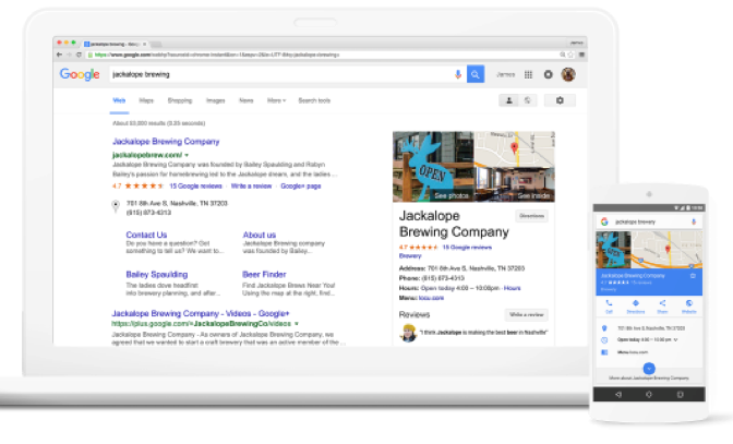
- Create a Google My Business page to get found by people conducting local searches
That’s all about optimizing a WordPress site for Google’s Mobile-first Indexing.
