
10 popular CSS grid systems for a website
CSS grid systems help in the creation of a simple and elaborate website. They are flexible with styling option & navigations and include varied layout patterns. In this article, we would discuss the 10 popular CSS grid systems for a website.
Golden grid CSS
The golden grid CSS system is a CSS tool for grid based sites. Golden grid CSS is considered one of the most perfect grid systems. Main features that are important are the tool being lightweight, simple and easy to learn. It has a 960 pixel main width and also a 6/12 overall grid system.

Preview of GoldengridCSS system
52 Framework
The 52 Framework system includes the 16 columns that are complicated within the grid framework and also includes features of HTML5. The grid framework is adapted and inspired from best grid systems. The CSS base for 52 framework is flexible. This framework is also one of the many best semantic forms of markup on the web.

Preview of 52 Framework system
978.gs
This is a grid system framework with 12 columns and 54 pixels, leading to 978 grid system. The grid system provides a viewport of 1024 pixels. This comes from margins on sides of layout and a native resolution. The grid system for website design uses the canvas size area from the given monitor size and also browser.

Preview of 978.gs system
BlueTrip CSS grid framework
The BlueTrip CSS grid combines the best of grid frameworks. The grid system provides a sensible set of guidelines for CSS grid and is more of a common technique to designing websites. A feature list that website includes comprises of 24 column grid, form styles and print stylesheet and status message styles.

Preview of BlueTrip CSS grid framework system
Blue Print CSS Grid system
The blue print CSS grid system is a good grid system that provides an amazing feature with reducing time for the website designs. The blueprint grid system fulfils its purpose with meaningful typography and style sheets for printing. This includes a CSS reset with tools, editors and templates for every step of workflow.

Preview of BluePrint CSS Grid system system
Baseline CSS
Baseline CSS has more typographic standards with a reset for default behavior and other additional features of styling for HTML forms and HTML5 elements. The baseline CSS framework includes relative positioning and padding, two versions. A simple grid system prototypes a website and builds from a real baseline grid as the foundation.

Preview of Baseline CSS system
Hashgrid
The Grid system for developing websites, hashgrid, is adaptable with varied layout widths and alignments. Other features for a vertical rhythm value are adaptable while hashgrid uses a single JavaScript file and CSS to control columns and grid lines. The function of hashgrid essentially provides a layout grid to webpage.

Preview of Hashgrid system
Content with style
Content with style is a grid system for website design that has good number of features. The content with style grid system includes both vertical and horizontal navigations. This grid system involves a content column with rapid development of websites with pre written components.

Preview of Content with style system
Yaml frame work
The yaml framework features the overall grid system from holding a tried and tested CSS designing. Includes slim framework core and CSS3, HTML5 while the technical features of optimized typography and rapid prototyping highlight the YAML framework. The framework includes developer support and provides a responsive design.

Preview of Yaml framework system
960 Grid System
The 960 grid system is designed to make your web development workflow more efficient, providing commonly used dimensions based on 960 pixels width. It has two variants: 12 and 16 columns, which you can use in tandem or separately. The 12-column grid consists of 60 pixel increments, while the 16-column grid is divided into 40 pixels wide portions.
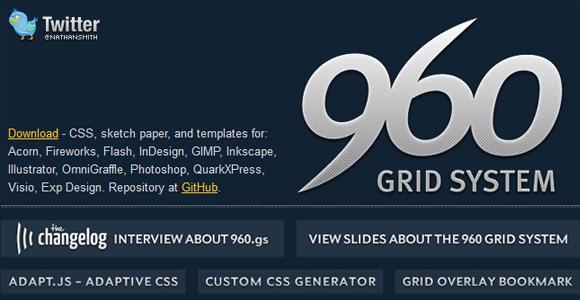
Preview of 960 Grid System
Conclusion
The most popular of CSS grid systems maintains a versatile and flexible design option for websites. In this article, we have discussed the 10 popular CSS grid systems for website. Readers of the article are invited to submit their comments and views.
