What heatmap tests can teach us?
Heatmaps are the best when it comes to analysing visitor behaviour. They are immensely popular among experienced web developers because they can take you to insights that are otherwise tough to reach even by incorporating other known to be best methods which actually boast of boosting the rate of conversion in the long run.. Heatmaps are believed to categorised into two – the mousetracking ones and the eyetracking ones. It is the price effectiveness that actually grabs the attention of bigger companies that go on to using mousetracking heatmaps. Let us explore heatmaps and find out what really makes them the big next shot for the businesses in the time to come.
Mousetracking and eyetracking heatmaps – tracking the difference!
Mousetracking heatmaps encourage fetching of the data from the actual visitors. On the other hand, when it comes to eyetracking heatmaps, there is a requirement for a group of users (usually addressed as ‘sample’ during the process) who are usually picked up from their normal environment. Eyetracking heatmaps are known to be producing distorted results due to the nature of its process. With eyetracking you can expect an accuracy nearing to 100% and when it comes to mousetracking heatmaps, the level of accuracy to be expected is around 80-85%.
Here are some more findings about the heatmaps that we should be sharing with you. Take a look.
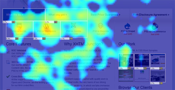
#Content must acquire the top of the page slot
We know that the attention span of the users when they are online is shorter than one can imagine and it’s the content that rules and fetches you the right kinds of benefits when placed above the fold. Content that rests above the fold actually invited almost 80% of the visitors’ attention. Hence, with this we need to emphasize that the materials that stand to be one of the most crucial aspects for your business goals must be right above the fold.
According to a recent study, the viewing time above and below the fold was found to be 80.3% and 19.7% respectively. However, this was a study that was conducted on the 1024×768 resolution but even though the people today work on larger resolutions, it can’t be denied that the core conclusion of the study will remain nearly same. However, the change in resolutions may create changes in the percentages only a bit (even if not much).
This means that the most crucial information needs to be placed above the fold. You must also keep in mind that scrolling over the page is possible only when the page layout allows and promotes it. With long pages, you need to be extra cautious and see to it that the design keeps the possibilities for scrolling open.
However, this may not be enough. Good call to action statements and suitable content needs to be placed at the bottom of the page as it will be an essential driver for conversions. It is important to craft the ending slot of your page because what users often see the last on your page remains on their minds and lastly, it’s often the “sign off impression” they take along with them.
#What strikes you is what you buy, when in haste!
According to a recent study, it was a found that when buyers are in haste, they buy what convinces them the most and sticks to their impulse in the first shot. Visual appeal has an important role to play here as it impacts the buyers’ preferences and choices largely. When buyers get distracted during the purchase or are in a hurry, either they don’t make the purchase at all or simply end up buying things plainly based on what they get to notice at that particular moment.
Now this usually happens with buyers who don’t have a stronger choice among all the other options they see. Since this is a world full of hasty people that also consists of your potential buyers, make sure you have a well-optimised website design so that nothing distracts them. arm yourself before it’s too late!
#Users see to the left and stick to the left
A lot of studies and researches in the past have clearly shown that the left half of any website gets the ‘most’, when it comes to the user attention. It is the left side on the web page that grabs the attention of the users at first. However, that doesn’t mean you will need to stack everything on the left side of the page so that it gets visible but it should be definitely utilised for displaying your value proposition or the most vital information that you want to be displayed on your website.
#People read web page content in F-shape pattern
Most of the people read the textual content in F shaped pattern which means that the people usually skim and read the beginning of any content which also includes the headlines. They read headlines but are selective as readers when it comes to reading the larger portions of the content. Hence it is important to place the most vital information of your content in the first two paragraphs as this is usually the part of your content that your visitors will most probably read.
Make sure that you use bulleted points, subheadings and even paragraphs (logically) to make the content interestingly readable, or something that the visitors can easily scan through. However, this is not really the case when it comes to images as the people scan through web pages containing images in a horizontal manner.
#Make logical use of contrasting colours on your page
Make sure that you use the right kind of colour contrast, which means better combination of colours when compared with the surrounding area. The right contrast and colour combination on the page gathers enough attention and also affects the scanning pattern of the visitors.
#Use photos to regain on that missing attention factor
People love messages that are conveyed visually, logically and beautifully and this stands well with almost anyone who browses online and your visitors are no exception. Well-selected images on the websites play a crucial role in driving conversion rate up and it seems to be an excellent idea – always.
Make sure that you use photos of the real people, as visitors seem to connect with them well. Be a little more careful while choosing product photos.
#Keep discounted price next to the original price
Doing this will boost up the purchase satisfaction of the buyers since it’s the relativity that has a major impact on the decision making that online visitors take every day. Since people usually take decisions based on the information that is made available to them at the time of purchase, mentioning the discounted price exactly next to the original price will also offer buyers a sense of achievement.
While these can offer you a good insight into the process that should work best, it is always suggested to conduct your own tests. Immensely useful tools are available that help you test your pages and analyse their “worth”. It is possible to create heatmaps from various kinds of data and when it comes to conversion optimisation, it refers to heatmaps generated with the help of data from the clicks and mouse movements. There’s a lot they teach us and it’s time to learn!
Author Bio :Colin Boykins is a blogger by profession and he is currently associated with leading UK based safety steps manufacturer – Safety-steps.co.uk.
