Goldilocks approach to Responsive Design: Where resolution doesn’t matter
Today, with more than 4,000,000,000 mobile devices in use, the practice of browsing the Internet through mobile is surpassing the use of internet on desktops and PCs. Due to its mobility and easy portability each individual prefers to browse the internet through his/ her mobile device instead of spending time in desktop browsing. This need of mobile browsing has given way to the concept of Responsive Web Design.
Responsive design and the current approach
No doubt with the growing demand of mobile browsing, the need for developing separate websites for mobile devices has taken a prominent space in the realm of web designing. But developing different websites to fit the screen resolutions of the mobile devices is not only time consuming and tedious, but also involves a lot of manpower and other resources. However, it is not practically possible to design websites for different screen resolutions. Hence, the web community has invented a novel concept of responsive design, whereby they create a single website conforming to the norms and guidelines of W3C and other standards. This single website is designed in such a manner that it fits the screen resolution of any device, be it a desktop or a mobile and is compatible across all the operating systems as well as the browsers. This concept has reduced the effort of the web developers who were till now spending time in designing the same website for different platforms and devices.

However, the current trend of responsive design is still based on certain specific devices and with the changing technology, it is expected to become outdated. Don’t you think, it would’ve been great if there were some universal standards for responsive design that made every website look similar in any kind of device, as if the layout has been specifically designed for that particular device only.
Disadvantages of the present trend
According to the current practices of responsive design, the layout is incorporated with a device by using the magnitudes of the most familiar devices in pixels. But experts consider it to be an unfair practice as it produces website patterns with two unchangeable elements, the pixels and screen resolution of the device.
-
Pixels:- The pixel measurement of each device is different from each other. For instance, the 16 pixel text on an iPhone is approximately 60% bigger than the 16 pixel text on a Macbook. Hence, the layouts that are designed based on pixel measurement of a particular device may create a discrepancy while viewing it on other devices affecting the usability and readability of the website as well as of its content.
-
Screen resolution of the device: – With the quickly changing technology, each day a new mobile device is out in the market that is half/completely different from its counterpart. Each device comes with a different screen resolution, and cannot acquire them all and then choose the best. After all, the device that we have picked might not support our required design, as with the advancement of technology the screen resolution of the devices too increases in size. For instance, the screen resolution of a mobile website with 600×400 pixel might appear outdated today.
The Goldilocks Approach

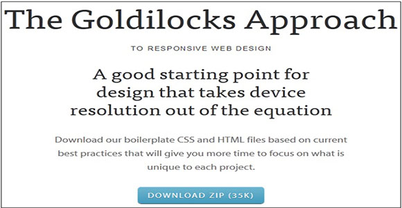
No matter whichever device you are using to view your responsive website design, by adopting the Goldilocks Approach, it will be possible to adjust the size of the layout to fit the screen size of your device. The Goldilocks Approach aims at making your web design independent of resolution by using an amalgamation of Media Queries, Max-Width, Pattern Translations and Ems.
The technique consists of two well noted files of Cascading Style Sheets which takes only 3 CSS Media Query increments into consideration, such as single column, narrow column and multi column. Along with this, the technique also takes typographic defaults with impeccable contexts into account.
For instance, if we consider a design for Apple’s devices, then it can be attained in five different versions: large display for iMac, small display for Macbook, retina display for iPhone4, portrait or landscape view for iPad and non retina display for iPhone.
But by applying the Goldilocks Approach we can attain only three specific displays like, very large display for multi column, tiny display for narrow column, while just right display for single column.
Conclusion
Thus, by adopting the above approach and ignoring the question of device resolution, we can get responsive designs that appear uniform across all devices. Thus, it is said that a website should comfort humans rather than on technology. In other words, a responsive website should be designed in such a manner that it is easily readable for us, rather than concentrating on the screen size and resolution of the device.


