9 New HTML5 and CSS3 Features You Should Try
Since the day they have been released, both HTML and CSS are continuously evolving to provide web designers and front-end developers with unlimited possibilities. With their every new version, several new features or improvements are introduced and things that are obsolete or don’t fit in the modern web development workflow are dropped to make the languages even better – which is really a great thing in itself.
Around four years ago, W3C (World Wide Web Consortium) set a goal to produce at least one revision of HTML5 roughly every year. Fulfilling its commitment, W3C released HTML 5.1 back in 2016 and now HTML 5.2, the second revision of HTML5, has also become the official W3C Recommendation. This simply means any new feature introduced in HTML 5.2 can now be implemented by web page developers in their projects. So, without further ado, let’s get into some exciting new HTML and CSS features that you can use to create better websites and applications in 2018.
New HTML5 Features to Try in 2018
# A Native < dialog > Element:
The main reason why the Web today is filled with innumerable ugly, unusable Dialogue boxes is the cumbersome implementation of dialogues in current HTML5. In spite of Dialogues are incredibly popular on the web, their implementation is significantly different from each other. No matter how well you try to implement Dialogues, making them 100% accessible is practically difficult.
The new < dialog> element aims to solve the same issue, making it possible for developers to easily create native custom dialogue boxes in pure HTML without having to worry about any pitfalls. The native dialogue box is created using the < dialog> element, which is hidden from view by default:
|
1 2 3 4 |
<dialog> <h2>Title…</h2> <p>Content…</p> </dialog> |
However, you can make the < dialog> modal visible with open attribute as follows:
< dialog open>
At the time of this writing, the < dialog> element is supported by Chrome, Chrome for Android, UC Browser for Android and Samsung Internet browser and behind a flag in Firefox. If you want to see how the native < dialog> element works, see our CodePen example in action.
See the Pen A Native <dialog&rt; Element Example by Ashish Kumar (@xjashish) on CodePen.
# Payment Request API:
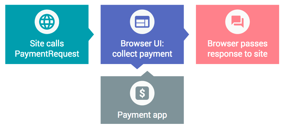
The Payment Request API promises to eliminate the use of complex and slow to load Checkout Forms for payments. It aims to provide users a more streamlined, consistent and error-free payment experience by moving the payment information retrieval process to the browser itself. In short, the main objective of this API is to make the transaction process as convenient and consistent as possible for both merchants and users. To understand how the Payment Request API actually works, take a look at the illustration shown below:
Until now, it was essentially impossible to make payment requests from iframes (e.g. third-party payment solutions such as Stripe and Paystack) embedded within a document and therefore you had to use third-parties’ own payment interfaces. To deal with the issue, HTML 5.2 has come up with a new attribute allowpaymentrequest which, if you apply to an iframe, allows it to use the API right on the user’s hosting web page.
< iframe allowpaymentrequest>

# Sizes for Apple Icons:
In HTML5, we use the < link rel=”icon”> attribute to define web page icons. On the other hand, to define the sizes of web page icons, the sizes element is used. For example:
< link rel=”icon” sizes=”16×16″ href=”image.png” >
Unfortunately, the sizes attribute is not supported by Apple’s iOS devices. It is only valid as long as the link relationship is icon. But in HTML 5.2, you can use the sizes attribute with Apple’s device-specific relationship, apple-touch-icon. Means, you’re no longer obligated to use the icon link relationship.
< link rel=”appple-touch-icon” sizes=”32×32″ href=”image.png”>
Although, as far as we know, the sizes element is currently not supported by Apple devices, this feature will definitely prove handy in near future whenever they do.
# Multiple < main> Elements:
The < main> attribute is used to specify the main content of a web page. According to HTML5 specification, the content inside this element should be unique to the particular page. Consequently, so far we have been using only one < main> tag per web page to maintain the standard.
However, with an exponential growth in the development of Single Page Applications (SPAs), sticking to this rule has become difficult for most of the web developers. Luckily, with the introduction of HTML 5.2, they can now have multiple < main> elements on a single webpage, as long as only one of them is visible to the user at a time.
|
1 2 3 4 5 6 7 8 9 |
<main> <h2>Visible</h2> </main> <main hidden> <h2>Not visible</h2> </main> <main hidden> <h2>Not visible</h2> </main> |
Another important rule to follow here is that only the hidden attribute must be used to hide any extra < main> elements. Any other method, e.g. display: none;, visibility: hidden;, or opacity: 0;, for hiding extra elements will not be valid.
#Headings in a < legend >:
Currently, if your form is somewhat long, you need to use the < fieldset> attribute for the grouping of multiple sections inside the form. In that case, the < legend> element acts as a plain text heading for different form fields defined within a < fieldset>.
|
1 2 3 4 5 6 7 8 |
<fieldset> <legend>Card Information</legend> <!-- Form fields for Card Information --> </fieldset> <fieldset> <legend>Delivery Information</legend> <!-- Form fields for Delivery Information --> </fieldset> |
Wouldn’t it be better if you can add Heading Tags like < h2> or < h3> to your < legend> tag and style it to fit your form requirements? Well, this would now be perfectly valid in HTML 5.2!
|
1 2 3 4 5 6 7 8 |
<fieldset> <legend><h2>Card Information</h2></legend> <!-- Form fields for Card Information --> </fieldset> <fieldset> <legend><h2>Delivery Information</h2></legend> <!-- Form fields for Delivery Information --> </fieldset> |
Needless to say this minor improvement will make all the sections better-looking and more navigable, specifically for those who on a document outline.
New CSS3 Features to Try in 2018
#CSS Scroll Snap Points:< /strong >
Scroll Snap Points is a recently introduced feature in CSS which promises to deliver users a fluid and precise scrolling experience on both input and touch-enabled devices. Allowing developers to define snap points horizontally or vertically, this new module of CSS gives them complete control over the scrolling behavior of a scroll container. The main objective of Scroll Snap Points is to enforce the scroll positions at which a container’s ‘snapport’ or ‘scrollport’ will end after the completion of a scrolling operation. To see how CSS Scroll Snap Points work, you may play with our CodePen example.
Unfortunately, this feature is not yet supported by most of the browsers.
#Inline CSS in < body >:
The new HTML 5.2 specification has made placing the < style> element anywhere within the < body> tag a completely valid practice. Needless to say, this new feature will have a huge impact on the component-based type of development. However, for performance reasons, it would still be better to place styles in the < head> of your HTML document, especially when you’re calling your CSS from an external source.
|
1 2 3 4 5 6 7 8 9 10 11 12 |
<body> <header> <p>Will be green</p> </header> <main> <p>Will be green</p> </main> <p>Will be green</p> <style> p { color: green; } </style> </body> |
A noteworthy thing in the above example is that the styles applied here are not scoped. It means the use-case is relatively limited and any inline CSS defined later in an HTML document will still apply to all the elements defined before it, which is why placing styles in the < body> section may lead to restyling and repainting. Hence, use this feature keeping the possible risk in mind.
#Native CSS Variables:< /strong >
With a number of CSS preprocessors, like Less, Sass, Cacheer CSS, available in the market today, it is now possible to use variables on CSS files and then parse it to regular CSS. Despite the fact that CSS variables work pretty well in most browsers, the concept of using native variables is quite new in the CSS specification. Below is an easy example of using native variables in CSS:
|
1 2 3 4 5 |
:root { --main-color: #7FFF00; } h1, h2, h3 { color: var(--main-color); } a { color: var(--main-color); text-decoration:bold } |
To learn more about CSS variables, you may visit the official W3C page.
#CSS’s @supports Rule:
When it comes to implementing a newly introduced CSS feature, browser compatibility is something every web developer has to struggle with sooner or later. Thanks to new CSS’s @supports feature, a part of the CSS3 Conditional Rules Specification, that not only allows developers to check whether or not a particular CSS property or value is supported by browsers but also lets them accordingly specify an alternative syntax for older or non-compatible browsers. This way they can control what browsers should display to users in case their default property declarations are not supported.
Here’s a simple example of how you can check browser compatibility for CSS blend modes using the @supports rule:
|
1 2 3 4 5 |
@supports (mix-blend-mode: overlay) { .example { mix-blend-mode: overlay; } } |
To display something equally impressive in browsers that don’t support mix-blend-mode, you’ll need to use the following syntax:
|
1 2 3 4 5 |
@supports not (mix-blend-mode: overlay) { .example { /* alternative styles will go here */ } } |
And the best thing is that the @supports rule is currently supported by all the latest versions of the major browsers, except IE11.
